
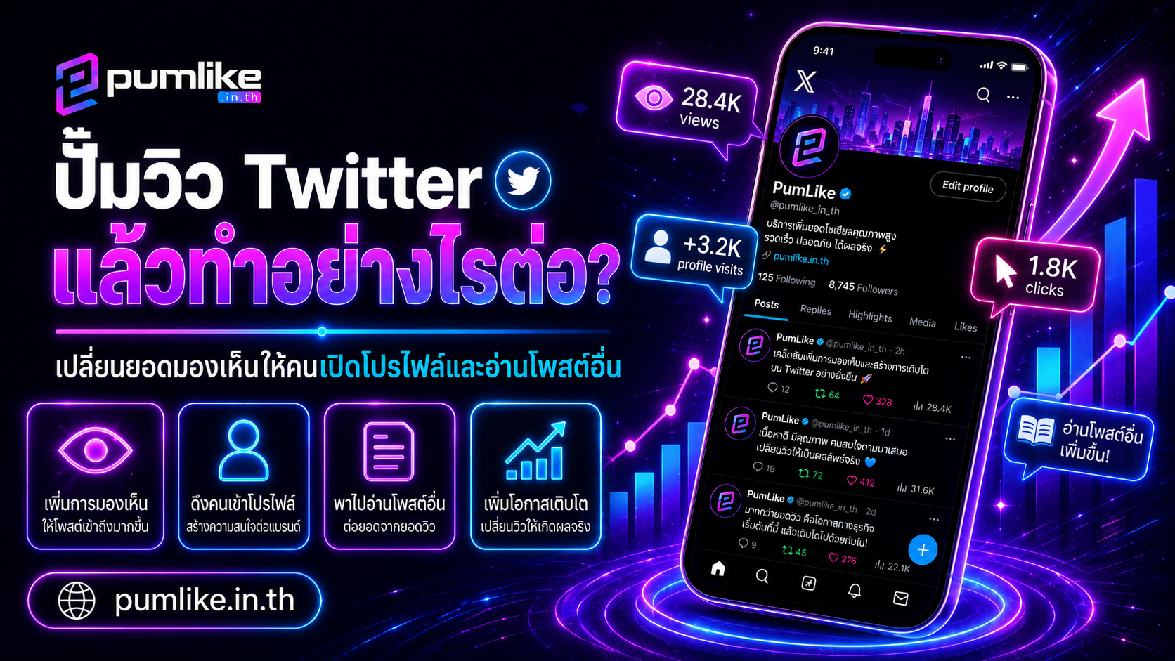
What Comes After a Twitter View Boost? Turn Visibility Into Profile Visits and More Post Reads
A higher view count can make a post more noticeable, but visibility alone does not guarantee that people will open the profile, explore older posts, or follow the account. What happens after a Twitter view boost depends on the complete path surrounding that post—from the opening message and profile image to the bio, pinned post, threads, and related content waiting on the account.
Think of a tweet as a sign outside a shop. More views can help more people notice the sign, but they will only step inside when the message matches their interests and the account gives them a clear reason to continue. A profile with an unclear identity, scattered topics, expired links, or no recent activity may lose attention even when one post receives many views.
The better objective is therefore not simply to increase Twitter views. It is to create a connected journey in which one visible post leads to a profile visit, a useful thread, a product page, a portfolio, or another relevant post. This approach turns a single number into information that can improve the entire content plan.
👀 Treat Views as an Entry Point, Not the Final Result
A view count indicates that a post has appeared on screen or received attention, but it does not show whether the message was understood. A tweet can have a high total without receiving meaningful replies, while a smaller post may generate profile visits, relevant questions, or new followers.
Before reviewing the next campaign, decide what action matters after the post is seen. A creator may want people to explore a portfolio. A store may need visitors to open a product page or send a message. An educational account may want readers to continue through a thread or save the information for later.
Once the intended action is defined, a Twitter view boost becomes one stage in a larger content path rather than an isolated number. It also becomes easier to judge whether the selected post is actually supporting the account’s purpose.
🧭 Give the Main Post One Clear Direction
Some tweets contain useful information but provide no reason to continue. Others ask the reader to follow, reply, open a link, read a thread, and send a message at the same time. Too many instructions can make the next step less obvious.
Choose one main action that matches the purpose of the post. A short educational tweet might direct readers to a detailed pinned thread. A featured design can invite visitors to open the profile and view the full collection. A product introduction may point to a single page containing price and ordering details.
The call to action should explain the benefit, not simply request attention. “See the full checklist in the pinned post” is more informative than “Please follow my account.” People are more likely to continue when they know what they will find.
🖼️ Make the Profile Image Easy to Recognize
On the timeline, profile images are displayed at a small size. Complex illustrations, tiny letters, and low-contrast colors can become difficult to recognize. When a viewer sees the account again, a clear visual identity helps connect the new post with the previous one.
Business accounts usually benefit from a simple logo with enough space around it. Creators and personal brands may use a clear portrait with good lighting and an uncluttered background. Keeping the same visual identity across related channels can also make the account easier to remember.
After increasing Twitter views, some users may decide whether to open the profile based only on the name, image, and first line of the post. A readable profile image therefore supports the transition from visibility to recognition.
✍️ Write a Bio That Explains the Account Quickly
When someone opens a profile, they usually scan the name, bio, link, and pinned post within a few seconds. A general statement such as “Sharing interesting things” does not explain why the account deserves continued attention.
A practical bio answers three questions: Who are you? What topics do you cover? What does a follower receive? For example, “Product photography and lighting tips for small online stores” creates a clearer expectation than simply writing “I enjoy photography.”
Contact details or links should also be current and easy to understand. Choose the most important destination rather than filling the profile with several unrelated paths. The goal is to reduce the number of decisions a new visitor must make.
📌 Turn the Pinned Post Into a Starting Page
The pinned post is one of the most valuable areas for people arriving from a promoted or highly visible tweet. An expired announcement, an old discount, or a broken link can stop the visitor’s journey immediately.
A store can use the pinned post to explain its main products, ordering process, delivery information, and contact channels. A creator may collect selected work and service details. An educational account can build an index of useful threads organized by topic.
The pinned post does not need to contain everything. It should provide a simple overview and direct visitors to the most useful next pages. Short sections, readable formatting, and working links make exploration easier.
🧵 Design Threads That Reward Continued Reading
Threads work well for tutorials, case studies, comparisons, personal experiences, and stories that require several stages. However, dividing a long paragraph into separate tweets does not automatically create a good thread.
The first post should clearly identify the problem and what the reader will gain. The following posts can expand one point at a time, while the final section should summarize the main lesson and suggest one related destination.
When the opening tweet receives additional views, inspect the whole thread before promotion. Make sure the sequence is complete, the images still load, and every referenced link works. Readers who enter through the first post expect a coherent continuation.
🔗 Connect New Posts With Existing Valuable Content
Accounts often publish useful posts that quickly become difficult to find. Connecting new material with older content gives each tweet a longer working life and encourages visitors to explore more than one idea.
A marketing account writing about headlines can link to an earlier audience-research thread. A store introducing a new product can direct people to an older tutorial that explains how to use it. A creator can connect a finished project with behind-the-scenes material.
This internal connection makes the account feel like an organized resource rather than a stream of unrelated updates. It also helps visitors understand the main themes without scrolling through every post.
🎯 Choose the Right Tweet Before Boosting Views
Not every post is equally suitable for a Twitter view boost. A strong candidate should make sense to someone who has never seen the account before. It should contain a clear point and lead naturally to a profile, thread, website, product, or pinned post.
Casual greetings, private jokes, or time-sensitive comments may depend too heavily on context. Account introductions, useful summaries, featured work, recurring questions, and evergreen advice are often easier for new viewers to understand.
Before selecting a post, ask two questions: Can a new visitor understand it without reading previous tweets? Is there a meaningful reason to explore further? When either answer is unclear, improve the post before increasing its visibility.
💬 Create Space for Genuine Replies
Twitter works best when communication does not remain one-directional. Relevant replies provide context, show that the account is active, and may help new visitors understand the subject more deeply.
End selected posts with a specific and easy question. “Which stage causes the biggest problem for you?” or “Which of these two methods are you currently using?” is easier to answer than a broad request such as “What do you think?”
When people respond, continue the conversation respectfully. There is no need to turn every reply into a sales message. Useful clarification and thoughtful responses often build more confidence than repeated promotion.
🗓️ Prepare Follow-Up Content Before the Main Campaign
A highly visible tweet can bring new visitors to the account, but interest may disappear when there is nothing recent to read. Before trying to increase Twitter views, prepare several follow-up posts that support the same topic from different angles.
- Educational post: Share a practical method, checklist, or short explanation.
- Discussion post: Invite readers to compare experiences.
- Portfolio post: Show recent products, services, or completed work.
- Summary post: Organize important ideas from previous threads.
- Related-content post: Guide visitors toward another useful topic.
A varied content mix prevents the profile from appearing like a continuous advertisement. It also gives different visitors more than one reason to remain interested.
📊 Measure Profile Visits and Continued Reading
After a Twitter view boost, do not evaluate success from the visible view count alone. Check whether more people opened the profile, explored the pinned post, continued through the thread, or visited a connected page.
A store can observe messages, product-page visits, and questions about ordering. Creators may watch for portfolio activity or collaboration inquiries. Educational accounts can review saves, relevant replies, and continued reading across connected posts.
When views increase but no other behavior changes, the main post may not contain a clear next step. Another possibility is that the profile does not explain the account’s value quickly enough. These areas should be reviewed before repeating the same campaign.
🧪 Test One Important Variable at a Time
Changing the headline, image, bio, pinned post, call to action, and posting time simultaneously makes it difficult to understand what improved the result. Use related topics and change one main element per test.
For example, compare two posts with similar information but different opening sentences. Another test may compare a text-only tweet with one supported by a clear image. The goal is not to make every post identical but to identify which structure encourages profile visits.
Record the results over several rounds. A post that produces more profile exploration with the same number of views provides a stronger model for future content than one that only displays a larger total.
🛍️ Guide Store Visitors Toward Complete Buying Information
A product tweet should offer more than a picture and product name. New visitors need benefits, price information, ordering steps, delivery conditions, and a reliable contact channel. When the details do not fit in one post, summarize the key points and connect to a dedicated page.
Increasing Twitter views for a sales post is more useful when the buying path is simple. The link should open correctly, the destination should match the advertised product, and messages should be monitored.
Stores with many products do not need to promote everything at once. Start with a featured product or a post that clearly introduces the brand, then observe which categories visitors continue to explore.
🎨 Help Visitors Find a Creator’s Best Work
Designers, photographers, writers, artists, and video creators may have many strong posts, but new visitors cannot appreciate them when the portfolio is difficult to navigate.
A pinned index or organized thread can group work by category. The post selected for additional Twitter views may feature a signature project, but it should also connect to related pieces, a process thread, or information about commissions.
A well-organized profile increases the chance that one visible post will lead to several more reads. It also makes professional inquiries easier because visitors can quickly understand the creator’s style and available services.
⚠️ What to Avoid After Views Increase
Avoid changing the account name, profile image, bio, and content direction all at once. Visitors who remember the original post may not recognize the updated profile. Visual improvements are useful, but important identity elements should remain consistent.
It is also unhelpful to boost every tweet before learning which posts generate profile visits. Testing one priority post at a time provides clearer information and reduces spending on content that has no meaningful continuation path.
Views should never be presented as proof of sales, endorsements, or popularity that cannot be verified. Review platform rules and service conditions, and keep promotional messages accurate so viewers are not misled.
🛠️ A Step-by-Step Plan After Increasing Twitter Views
First, confirm that the main tweet has one clear message and one next action. Second, update the profile image, bio, link, and pinned post so a new visitor understands the account quickly. Third, prepare at least two or three related posts to support continued reading.
During the campaign, observe views together with profile visits, thread activity, replies, link activity, and relevant inquiries. When a post successfully brings people to the profile, adapt its structure for other topics rather than copying the same wording.
When people see the tweet but do not open the profile, improve the opening and call to action. When they open the profile but do not follow or read more, review the bio and pinned post. When new followers arrive but do not return, strengthen the publishing rhythm and conversation.
✨ Final Takeaway: Give Every View a Path to More Content
A Twitter view boost can increase the first layer of visibility, but profile visits and continued reading depend on the account’s structure. Clear messaging, a recognizable image, an informative bio, and a useful pinned post help turn attention into exploration.
Choose a tweet that works without previous context, give it one purpose, and connect it to a relevant thread, product, portfolio, or resource. Evaluate what visitors do next instead of focusing only on the total view count.
Before placing an order through Pumlike.in.th, confirm the post link, service name, minimum quantity, and applicable conditions. One tweet may bring people to the entrance, but the quality and organization of the full profile determine whether they continue reading and return later.

Created a Facebook Group but No One Is Joining? What to Fix and How to Grow Members Strategically
A Facebook group can begin with a useful idea, a clear topic, and a moderator who genuinely wants to build a community. Even so, the member count may remain almost unchanged after launch. Some people may visit the group without requesting access, while others join once and never return because the feed does not yet give them a reason to participate.
This does not always mean the topic is uninteresting. The problem may appear earlier in the journey: the group name is too broad, the cover image does not communicate a benefit, the description is incomplete, or the first few posts do not show what members can expect. When these elements are unclear, increasing the displayed member count alone will not solve the underlying issue.
A Facebook group member boost is most useful after the foundation has been prepared. It should support a group that already has a recognizable purpose, useful starter content, understandable rules, and an administrator ready to welcome new people. The objective is not simply to make one number larger, but to create a better starting point for a community that can continue growing.
🔍 Identify Where Potential Members Are Dropping Off
Before changing anything, separate the problem into stages. A group that nobody can find has a different challenge from a group that receives visits but few join requests. A third group may gain members steadily while still receiving almost no posts or comments.
Start by reviewing three moments. First, consider how people discover the group. Does the name contain a clear subject that the intended audience would recognize? Second, examine the group preview. Can visitors understand who the community is for and what they will receive? Third, look at the experience after joining. Is there a welcome post, useful content, or a simple question that helps new members participate?
If discovery is weak, improve the name and promotion channels. When people visit but do not join, review the cover, description, privacy setting, and recent posts. If the member count grows while activity remains low, the next priority should be community management rather than another increase.
🪧 Give the Group a Name That Explains Its Purpose
A short name can look clean, but it may be too vague to attract the right audience. A title such as “Online Business Community” could refer to advertising, content creation, ecommerce operations, affiliate marketing, or networking. Visitors may not know whether the discussions are relevant to them.
A stronger name normally combines the main topic with the intended audience or location. Examples include a product photography group for small online shops, a beginner community for short-form video creators, or a local marketplace for a specific product category.
There is no need to fill the name with every possible search phrase. Choose one clear direction, then use the group description to explain the remaining details. This keeps the title readable while still supporting Facebook group SEO and relevant search intent.
🎨 Make the Cover and Description Work Together
The cover image, group name, and short description form the first impression. If the cover looks like an advertisement while the description sounds like a general discussion board, visitors may be unsure what the community actually provides.
A mobile-friendly cover should use limited text and a strong visual hierarchy. It may state the main topic, who the group is designed for, or one practical benefit. Small paragraphs and crowded design elements are difficult to read on a phone.
The description should answer four basic questions: Who should join? What topics are discussed? What may members post? What is not allowed? For example, a community for online-store photography could welcome equipment questions, lighting examples, and portfolio feedback while restricting unrelated sales posts.
Clear information helps suitable members decide faster and discourages people who are unlikely to engage with the topic.
📌 Publish Starter Content Before Promoting the Group
Many new groups remain empty because the owner waits for members to arrive before publishing. From a visitor’s perspective, however, a group with no useful posts can appear unfinished or inactive. Preparing content in advance makes the space easier to understand.
- Welcome post: Explain the purpose and tell new members where to begin.
- Rules post: Summarize acceptable content and prohibited behavior.
- Practical guide: Share information members can apply immediately.
- Conversation starter: Ask a simple question related to the group’s topic.
- Resource post: Collect useful links, FAQs, or important discussions.
These posts do more than fill the feed. They establish the expected tone and provide examples of the kind of contributions the group wants to encourage.
🤝 Confirm What the Selected Service Actually Adds
Before ordering, check whether the service refers to group members, followers, join requests, or another type of result. Similar labels may describe different functions, and the outcome depends on the service details rather than the short category name alone.
Review the minimum quantity, required link format, delivery conditions, and any group settings that may affect processing. A request to increase Facebook group members may not match a service designed for a page, profile, or post.
A quick link check can prevent several common problems. Open the destination in a private browser window where possible, confirm that it leads to the intended group, and make sure the privacy or approval settings are compatible with the selected service.
📊 How Many Group Members Should You Start With?
The starting amount should match the group’s current appearance. A brand-new community with a few posts and no ongoing conversation should not immediately resemble a group with tens of thousands of active members. The feed, posting schedule, and level of moderation need enough time to develop.
For a prepared new group, approximately 50–200 members may be used as an initial planning range. A group that already has genuine members, regular posts, and basic interaction may consider around 200–1,000 members, depending on its size and promotional goal.
These figures are examples, not guarantees or universal rules. A group starting with twenty members will experience a different change from a community that already has several thousand. Service minimums and the group’s existing numbers should always be reviewed together.
🧪 Divide Growth Into Manageable Stages
Increasing the full target in one order can make evaluation difficult. A staged approach gives the administrator time to see how the group looks, which posts receive attention, and whether the welcome process is clear enough.
After the first stage, new questions may appear repeatedly. Those questions can become an FAQ post or a pinned guide before the next round. If members join but do not know where to begin, the administrator can rewrite the welcome message and link directly to important discussions.
Smaller stages also improve budget control. There is no reason to continue increasing the number while the content schedule, moderation system, or member onboarding still needs improvement.
💬 Give New Members an Easy Way to Participate
A high member count does not automatically create conversation. New members often observe the group quietly before posting. When they see unanswered questions, unrelated promotions, or no activity from the administrators, they may remain silent and eventually stop visiting.
Conversation starters should be easy to answer. Ask what challenge members currently face, which method they have already tried, or what topic they want the group to cover next. Questions that require a long personal story may receive fewer responses from people who have just joined.
When someone replies, a moderator should acknowledge the contribution and continue the discussion where appropriate. A brief, relevant response is often enough to show that the group is being actively managed.
🗓️ Build a Content Rhythm the Community Can Recognize
Posting every day is not required, especially when daily content would reduce quality. Consistency is more useful than frequency. A simple weekly pattern may include a practical tip, a midweek discussion, and a member showcase at the end of the week.
Buying and selling communities may designate specific promotional days. Educational groups can schedule question-and-answer posts, resource collections, or monthly topic discussions. A predictable rhythm gives members a reason to return.
Balance administrator content with member participation. When only the owner publishes, the group may feel like a second Facebook page. When every post is accepted without review, spam and unrelated promotion can take over the feed. A healthy group needs both openness and structure.
🛡️ Clear Rules Help Retain the Right Members
Some groups gain members quickly but lose them because of repeated advertising, aggressive arguments, copied posts, or off-topic content. Group rules are not merely restrictions; they explain what kind of environment the community is trying to maintain.
Rules should be easy to read and consistently applied. They may cover duplicate posts, respectful communication, personal information, external links, sales requirements, and the expected approval time for moderated posts.
Members are more likely to trust a community when the same standards apply to everyone. Consistent moderation contributes more to long-term confidence than a large number displayed near the group name.
📣 Promote the Group Where Interested People Already Gather
Alongside a Facebook group member boost, use the audience channels already available to the brand or administrator. A Facebook page, website, customer list, creator profile, or related content series can introduce the group to people who already care about the subject.
The invitation should explain the benefit instead of presenting only a link. A camera shop could invite customers to a group for setup advice and photo feedback. A business educator could open a discussion group for practical case studies. A product brand might use a community for tutorials and customer experiences.
Targeted invitations usually create more returning members than broad promotion with no explanation. People are more likely to participate when the group clearly connects to an existing interest or problem.
📈 Measure Activity, Not Only the Member Total
After increasing Facebook group members, review what happens inside the community. The displayed total is only one metric. Weekly posts, comments, returning readers, useful questions, and member-generated discussions reveal whether the group is becoming active.
- Are new members opening the welcome and pinned posts?
- Do discussion questions receive more replies?
- Have members started creating relevant posts?
- Has spam increased as the group becomes larger?
- Is the group producing better questions, leads, or community feedback?
When membership grows without any reading or discussion, improve onboarding and content. If growth creates more spam, strengthen approval settings and moderator coverage before continuing.
⚠️ Common Reasons a Group Has Members but No Community
A frequent mistake is launching without a narrow purpose. Different members then arrive with different expectations, making it difficult to build a consistent conversation. Another problem is writing the name and description like a long promotional message rather than explaining the group’s ongoing value.
Groups can also become quiet when administrators focus on recruitment but do not respond after people join. A new member who posts a question and receives no reply may not return. Leaving unrelated content visible for too long can also discourage people who joined for a specific topic.
Not every member needs to post frequently. Real communities include active contributors, occasional commenters, and silent readers. The aim should be to provide several ways to participate rather than forcing identical behavior from everyone.
Administrators should review Facebook’s current rules and the conditions of any service before placing an order. Additional members cannot replace useful content, spam control, fair moderation, or genuine relationships within the group.
🛠️ A Step-by-Step Plan for Reviving a Quiet Group
Begin by rewriting the name, description, and cover so visitors understand the topic within a few seconds. Prepare several starter posts, publish a readable set of rules, and pin a welcome message that directs people to the most useful content.
Next, invite a small number of relevant people from existing pages, customers, or personal networks. Their early questions and responses can help establish a natural discussion pattern. Once the group has enough content and active moderation, a Facebook group member boost can be tested at a level that fits the existing base.
After the first round, compare membership growth with post views, comments, new discussions, and moderation workload. Continue only when the group can support the additional audience. Otherwise, pause and strengthen the experience before expanding further.
✨ Final Takeaway: Increase the Right Number, Then Give People a Reason to Stay
A Facebook group with few members may be struggling with discoverability, first impressions, unclear positioning, or an empty feed. Identifying the exact stage where people lose interest makes the solution much easier to plan.
A Facebook group member boost works best when the group already has clear information, useful starter content, an onboarding process, and moderators who are ready to participate. Begin with a reasonable amount, divide growth into stages, and confirm that the selected service matches the intended result.
Before ordering through Pumlike.in.th, verify the group link, privacy settings, service name, minimum quantity, and conditions. Member growth may help the community establish an initial presence, but valuable discussions and consistent management are what encourage people to remain.

Posted a Video but the Views Are Stuck? What to Fix Before Using a Facebook View Boost
A video can take hours to plan, record, edit, subtitle, and publish, yet receive only a small number of views after going live on Facebook. That result does not automatically mean the content is poor. Low reach may come from the opening scene, video format, caption, publishing time, page activity, or a mismatch between the subject and the audience currently following the page.
Deleting and reposting the video immediately is rarely the best first move. It is more useful to identify where viewers are dropping off and whether the post gives them a reason to stop scrolling. A strong video may still struggle when its first few seconds are unclear, while a well-written caption cannot fully rescue footage that takes too long to reach the main point.
A Facebook view boost can support a prepared post, but it should not replace basic content improvements. The most practical approach is to fix the visible weaknesses first, choose one suitable video, and start with an amount that fits the normal size of the page.
🔎 Begin With the First Three Seconds
Facebook users move through the feed quickly. When the opening frame does not explain the topic, viewers may scroll away before the video has a chance to become interesting. This often happens when a clip begins with a long logo animation, a silent setup, or a wide shot that does not show the main subject clearly.
Play the video without sound and watch only the first three to five seconds. Ask whether a new viewer can understand what the clip is about. The answer should be visible through the image, on-screen text, or an immediate demonstration of the result.
A product video might begin with the finished result before explaining the process. A tutorial can open with the problem it solves. A restaurant clip can show the completed dish first rather than several seconds of preparation. Bringing the most useful moment forward helps viewers decide whether they want to continue.
🎬 Review the Video Before Increasing Its Views
Before considering a Facebook video views service, watch the entire clip as though you have never seen the page before. Look at pacing, image clarity, sound balance, subtitles, and the amount of information presented in each section.
- Opening frame: Introduce the subject, product, result, or question immediately.
- On-screen text: Keep it short, readable, and away from important visual details.
- Audio: Make sure music does not overpower speech and that the volume remains consistent.
- Editing pace: Remove pauses that do not add information or atmosphere.
- Ending: Finish with a clear conclusion or one practical next step.
The video does not have to move at maximum speed. Some educational or storytelling content needs time to breathe. The key is that every section should have a purpose. If a scene neither explains, demonstrates, entertains, nor moves the story forward, it may be worth shortening.
📱 Choose the Format That Matches Facebook Viewing
Many Facebook viewers watch on mobile devices. Vertical and square videos usually occupy more screen space in the feed, while horizontal videos can appear smaller. This does not make landscape footage unusable, but important details must remain visible on a phone.
Reels often suit quick tips, product demonstrations, transformations, and short entertainment. Longer videos may work better for interviews, step-by-step lessons, case studies, or stories that need more context. The format should follow the content rather than forcing every idea into the same length.
Subtitles are also valuable because some people begin watching with the sound turned off. Captions should summarize the spoken message instead of covering the screen with long paragraphs. Clear text can help a viewer understand the video before choosing to turn on the audio.
📝 Strengthen the Caption Around the Video
A caption gives the viewer a reason to press play. It does not need to repeat everything said in the video. Its job is to introduce the benefit, question, or problem in a way that matches the content.
Instead of writing only “Please watch and follow,” explain what the viewer will receive. A caption such as “Three reasons customers leave a product page before ordering” creates a clearer expectation than a general request for engagement.
The first sentence matters most because long captions may be shortened in the feed. Put the main idea near the beginning, then add supporting information, ordering details, or a single call to action. Too many instructions can weaken the post because the viewer does not know which action is most important.
Hashtags can help organize topics, but a long collection of unrelated tags may make the post difficult to read. Select a few phrases connected to the industry, product, location, or content category instead of inserting every popular keyword available.
🏪 Make Sure the Page Is Ready for New Visitors
A video may receive attention, but the page still needs to convert that attention into further activity. When viewers open a profile and find an unclear logo, outdated contact information, months of inactivity, or no explanation of what the page offers, they have little reason to continue exploring.
Business pages should show basic information such as product categories, ordering steps, contact channels, delivery details, and recent posts. Creator pages should make it easy to find previous work, playlists, or examples that represent the account clearly.
Before trying to increase Facebook video views, review the page like a first-time visitor. The profile image, cover, introduction, pinned content, and recent posts should support the message of the selected video. A complete page gives each new view more potential value.
⏰ Test Posting Times Instead of Trusting One Formula
There is no single publishing time that works for every Facebook page. A restaurant may receive attention before lunch or dinner. A business education page may perform better during breaks or after working hours. Entertainment content can follow a completely different pattern.
Choose two or three reasonable time windows and compare similar posts across several weeks. Do not judge the schedule from one video because the subject, thumbnail, and opening also affect performance.
Once a useful pattern appears, reserve the stronger time window for priority content. Regular updates can be distributed around it so that several posts are not competing for the same audience at once.
📌 Select the Right Video for a Facebook View Boost
Not every upload deserves the same level of support. A suitable video should have a clear subject, a useful opening, understandable visuals, and a defined purpose. It may introduce the page, explain a popular product, answer a common question, or highlight a piece of content that already keeps viewers watching.
When several videos are available, choose one strong candidate first. Applying a Facebook views boost to every post at the same time makes it difficult to identify which content genuinely performs well and which content still needs improvement.
A video that has already received some organic reactions, shares, or meaningful watch time may be a better test than a clip viewers repeatedly leave during the opening. Existing signs of interest suggest that the topic has potential.
📊 How Many Views Should a Page Start With?
The starting amount should reflect the page’s existing numbers. If most posts receive fewer than one hundred views, suddenly adding tens of thousands to one video may create a sharp difference from nearby content. An established page with a regular audience may need a higher range before the change becomes noticeable.
A small or recently active page might test approximately 100–500 views on one prepared video. A page with consistent posting and an existing viewing base may consider around 500–2,000 views, depending on its normal results and the importance of the campaign.
These ranges are planning examples rather than guarantees. Service minimums, delivery speed, video type, platform conditions, and the page’s own history should all be reviewed before placing an order.
🧪 Use Smaller Test Rounds
When the appropriate amount is unclear, dividing the plan into smaller stages can provide better information. Begin near the lower end, allow the result to settle, and then compare the post with the rest of the page.
This pause may reveal that the thumbnail needs improvement, the caption is too vague, or the first scene is slower than expected. Fixing those issues before the next round is usually more useful than continuing to increase the displayed number.
A staged approach also makes budget control easier. The page owner can stop when the post has reached its intended role rather than continuing simply because a larger package is available.
📈 Look Beyond the Total View Count
Views are easy to notice, but they do not explain whether people remained interested. A video with a large total and very short watch time may contribute less than a smaller video that viewers complete, share, or use to discover the page.
After using a service to increase Facebook video views, review other signals where available:
- How many people stayed beyond the opening seconds?
- Did viewers reach the middle or end of the video?
- Were there more page visits after the post?
- Did related videos receive additional attention?
- Did the page receive relevant messages, comments, or product questions?
If the visible views rise but no other behavior changes, the next step should be content review rather than an immediate second order. The video may be reaching the wrong audience, presenting a weak offer, or failing to show the value early enough.
🎯 Match the Measurement to the Video’s Purpose
Different videos need different success measures. A brand introduction may aim for page visits and recognition. A product demonstration may focus on completion rate and customer questions. A promotional clip may be designed to generate messages, link clicks, or orders.
Before trying to boost Facebook views, define what the viewer should do after watching. Without that next step, a higher total can be difficult to evaluate.
Use one clear call to action, such as “View the full details in the pinned post,” “Send a message for availability,” or “Follow the page for the next part.” Several competing instructions in the same video may reduce response.
⚠️ Why More Views Sometimes Produce Little Result
One common mistake is choosing a video only because the page owner likes it. The editing may be attractive, but the subject may not answer a real audience question. Another mistake is promoting a post that does not provide a price, ordering method, product benefit, or clear explanation.
Giving every upload identical view totals can also hide useful information. Natural audience response varies by topic, timing, presentation, and relevance. Differences between posts help reveal which ideas deserve to be repeated.
Page owners should also review Facebook’s current rules and the terms of any service they use. Additional views cannot replace original content, customer support, consistent publishing, or genuine communication with followers.
🛠️ A Practical Fixing Sequence
First, inspect the opening seconds and replace any slow or unclear introduction. Next, rewrite the caption so that the benefit appears in the first sentence. Then review the page to ensure visitors can understand the business or creator immediately.
Publish at a time supported by previous page data and allow the video to collect an initial response. When the content is ready but the starting visibility remains low, test a modest amount rather than jumping directly to the largest option.
After the first round, compare total views with watch behavior, profile visits, engagement, and relevant inquiries. Based on those results, decide whether to edit the post, add a small second round, or move the budget to a stronger video.
✨ Final Takeaway: Improve the Clip, Then Support the Right Post
When a Facebook video receives fewer views than expected, the cause may be the hook, caption, format, publishing time, or page readiness. Reviewing each part separately provides more useful answers than assuming the page has no audience.
A Facebook view boost works best as support for content that is already clear and prepared. Select one priority video, begin with an amount that matches the page’s normal scale, and evaluate the result in stages.
Before ordering through Pumlike.in.th, confirm the destination link, read the service details, and check the minimum quantity and conditions. The most effective plan is not simply to increase a number, but to use the new data to improve the next video and the overall content strategy.

How Many Credit +1 Boosts Should You Start With? Choosing the Right Amount for Every Account Type
A brand-new profile with only a few posts should not be treated the same way as an established account that has published content for months. Both may want to make an important post more noticeable, but their account history, audience size, posting frequency, and average engagement can be completely different. This is why choosing a starting amount should be based on the account itself rather than copying a number used by someone else.
The most useful question is not “What is the largest package available?” but “What amount fits the current size and activity of this profile?” Starting with a measured amount makes it easier to review the result, manage the budget, and adjust the next order without creating a sudden difference between one post and the rest of the account.
This guide explains how to approach a Credit +1 boost for new profiles, returning accounts, online stores, creators, and active pages. It also covers when a comment boost may support a post and when improving the content itself should come first.
🧭 There Is No Universal Starting Number
Think of a social profile as a storefront. A newly opened shop with only a few items on display would usually start with a simple presentation. A larger store with a familiar customer base, visible reviews, and regular activity can support a stronger promotional push without making the overall appearance feel inconsistent.
The same principle applies to online accounts. A profile with a complete bio, a recognizable image, several useful posts, and regular audience activity has more context to support a higher starting amount. A nearly empty profile may benefit more from completing its information and publishing several posts before adding extra signals to one piece of content.
Account size is only one factor. The purpose of the post also matters. A product launch, portfolio highlight, campaign announcement, or introductory post usually deserves more attention than a routine update. Choosing according to importance is often more effective than applying the same amount to everything.
🔍 Review These Four Points Before Ordering
A quick account check can prevent most mismatched orders. Before choosing a number, review the account’s age, available content, usual response level, and the goal of the selected post.
- Account history: New profiles generally need a lighter starting point than pages with consistent activity.
- Content volume: A profile should contain enough useful material for visitors to explore after opening it.
- Previous engagement: Compare the selected post with the usual performance of recent content.
- Post objective: An introductory post, product promotion, tutorial, and portfolio item may each require a different approach.
These points are more useful than choosing a package simply because it is popular. They provide a practical reference for deciding whether to begin at the lower, middle, or higher end of an available range.
🌱 Starting With a New Account
A newly created profile often has fewer than five or ten posts, limited history, and no clear engagement average. In this situation, publishing a complete set of basic content should come before trying to strengthen a single number.
Make sure the profile includes a clear photo or logo, a useful introduction, contact information where relevant, and several posts that explain what the account offers. When visitors arrive, they should understand whether the profile belongs to a store, creator, community, service provider, or personal brand.
For a small new account, a trial range of approximately 5–15 units on one important post may be enough to evaluate how the result fits the page. This is not a fixed rule or guaranteed formula. An account with more prepared content may begin near the middle of the range, while a nearly empty page should stay near the lower end.
Starting small also creates a useful baseline. After reviewing the first result, the owner can decide whether the next post needs the same amount, a modest increase, or no additional support at all.
🔄 Bringing an Inactive Account Back
Older profiles sometimes remain inactive for months before returning with new products, updated branding, or a different content direction. Although these accounts already have history, they should not immediately jump into a large campaign on the first day back.
Begin by updating outdated descriptions, broken links, profile images, and contact details. Publish two or three fresh posts so returning visitors can see that the account is active again. A reintroduction, a useful update, and a new featured post can create a smoother transition.
Once the account has restarted its posting rhythm, an example range of 10–30 units may suit a key post. The final choice should still reflect the account’s previous audience and current response. A page with an active remaining follower base can begin closer to the middle, while an account with little recent activity may be better near the lower end.
📈 Active Profiles Should Use Their Own Average
An account that posts regularly already has valuable data. Review the latest five to ten posts and note the typical response range. This gives a more realistic benchmark than comparing the account with a much larger creator or business page.
For an established profile with consistent content, an initial range of around 20–50 units may be considered for a priority post. The number should support the existing pattern rather than overshadow it. A result that is dramatically higher than every nearby post may not match the account’s normal appearance.
It is also unnecessary to give every post identical numbers. A major announcement can reasonably receive more attention than a minor update. Allowing different posts to perform differently reflects the fact that content quality, timing, relevance, and audience interest naturally vary.
🛍️ Online Stores Should Prioritize High-Value Posts
Online shops usually publish several types of content: product photos, discounts, customer feedback, tutorials, restock announcements, and general updates. Applying the same amount to all of them may waste the budget and make it harder to identify which posts actually help the business.
A recently launched store may test approximately 15–30 units on a store introduction, best-selling product, or important promotion. A more established shop with regular orders and an active customer base may consider around 30–80 units, depending on its normal engagement and campaign size.
For a larger promotion, dividing the activity into smaller stages can make evaluation easier. The shop can review the first result, monitor profile visits or inquiries, and then decide whether the campaign needs additional support.
The post itself must also be ready. Include the price, product details, delivery information, ordering steps, and a clear contact method. Additional visibility cannot compensate for missing information that customers need before making a decision.
🎨 Creators Can Focus on Signature Work
Artists, photographers, designers, reviewers, writers, and video creators often have several posts that represent their work better than others. Supporting a small group of signature pieces usually makes more sense than trying to give every upload a similar result.
A range of around 15–40 units may be used as an initial reference for a featured portfolio item, a new series, or a particularly important release. Afterward, look beyond the displayed number. Check whether visitors explore other posts, follow the account, save the work, or send a genuine inquiry.
For creators, the quality of the portfolio remains the main reason people stay. A boost may help one piece receive initial attention, but clear presentation, consistent style, and regular publishing are what build long-term recognition.
💬 When Does a Comment Boost Make Sense?
A +1 service and a comment boost do not serve exactly the same purpose. One adds a visible quantitative signal, while comments introduce conversation and context. Using both at the same time is not automatically the best choice.
A short product image with almost no explanation may not naturally invite many comments. A detailed review, comparison, personal story, question, or tutorial may create more room for discussion. The type of content should therefore determine whether additional comments fit the post.
When comments are included, they should relate directly to the subject. Repeated generic phrases add little value and may make the conversation feel artificial. A smaller number of relevant responses is generally more useful than a long collection of nearly identical messages.
A practical approach is to begin with one main service, evaluate the result, and add another element only when it has a clear purpose. This makes it easier to understand which part influenced the post and prevents too many changes from appearing at once.
📊 What to Monitor After the First Round
Once the first order is complete, avoid increasing the amount immediately. Allow enough time to observe how the post fits alongside the rest of the profile. The displayed total is only one part of the evaluation.
- Did more people open the profile?
- Did visitors continue to other posts?
- Were there new genuine followers, messages, or product questions?
- Does the result match the account’s recent average?
- Did the selected content perform better because it was useful, timely, or clearly presented?
If the result already supports the goal, there is no need to order more immediately. Keeping activity connected to a real publishing schedule often produces a more coherent profile than repeatedly increasing one post without adding new content.
⚠️ Common Mistakes That Create an Uneven Profile
One frequent mistake is using the number from a large account as a target for a new profile. The two pages may have completely different histories, audiences, and publishing habits. A figure that appears ordinary on one account may stand out sharply on another.
Another issue is promoting a post before it is ready. If the caption lacks useful information, the image is unclear, or the ordering process is missing, extra attention may not lead to meaningful action.
Making every post display almost identical totals can also create an overly uniform pattern. Real audiences respond differently to announcements, tutorials, sales posts, and casual updates. Allowing this variation makes the profile easier to understand and gives the owner better data about what the audience prefers.
Users should also read the rules of the platform they use and review the conditions of each service before ordering. Paid signals cannot replace good content, honest customer service, or genuine communication with an audience.
✅ A Simple Three-Step Starting Method
First, choose one priority post instead of applying the service across the entire profile. Second, select a lower or middle amount that matches the account’s present size. Third, wait and assess the result before deciding what to do next.
This method makes budget planning easier and provides a clear reason for every order. As the account publishes more content and develops an authentic audience, the suitable amount may change. There is no need to keep using the same number forever.
🌟 Final Takeaway: Let the Account Set the Starting Point
The right starting amount for a Credit +1 boost depends on the account’s history, content quality, typical response, and purpose. New profiles generally benefit from a smaller test. Active accounts can use recent performance as a reference, while stores and creators should concentrate on posts that carry the most value.
A balanced approach is to begin with enough activity to evaluate the result, rather than choosing the highest option available. When a comment boost is considered, it should add relevant discussion instead of simply increasing another number.
Before placing an order through Pumlike.in.th, review the service name, minimum quantity, conditions, and destination link carefully. Matching the amount to the account provides a clearer plan, better budget control, and more useful information for the next campaign.
Stop Guessing the Quantity! Enter Your Budget and Let the System Calculate It Automatically
Many users know exactly how much they want to spend but are unsure how many units they can order with that budget. Without a calculation tool, they may need to enter different quantities several times, check the total price, and repeat the process until the amount matches their spending limit.
This can be inconvenient, especially when each service has a different rate, minimum quantity, maximum quantity, or ordering condition. To make budget planning easier, Pumlike.in.th includes a feature that calculates the order quantity from the amount of money entered by the user.
Instead of starting with a quantity, you can begin with your preferred budget. The system will use the selected service rate to calculate a suitable quantity automatically. This reduces manual calculations and helps users understand how their budget relates to the number of units they can order.
Select the Right Service First
Before entering your budget, open the order page and select the correct platform, category, and service. This step is important because each service may use a different rate and support a different type of social media link.
Read the service description carefully before continuing. Check the supported URL format, minimum and maximum quantity, account or content visibility requirements, and any other conditions shown on the page.
Once the correct service has been selected, open the budget calculation option and enter the amount you plan to spend. The system will calculate the available quantity based on that service.
A More Convenient Way to Plan Your Spending
This feature is useful for beginners who may not yet understand how service rates are converted into order quantities. It is also helpful for online sellers, content creators, agencies, and social media administrators who need to divide a fixed budget between several posts or accounts.
For example, when you already have a set amount for promoting one piece of content, you can enter that amount first and let the system calculate the quantity. There is no need to open a separate calculator or repeatedly change the order amount.
After the result appears, check that the calculated quantity is within the service limits. When changing the budget or selecting another service, wait for the displayed result and total price to update before proceeding.
Review Everything Before Confirming
Automatic calculation makes the ordering process easier, but users should still review all information before submitting an order. Confirm that the selected service matches your platform, the link is correct, the calculated quantity is suitable, and the final price does not exceed your planned budget.
The tutorial video included with this article demonstrates how to enter a budget and view the calculated quantity step by step. You can watch it while using the order page and follow the process on your phone or computer.
By starting with the amount you are ready to spend, the Pumlike.in.th budget calculator can help you plan orders more clearly, reduce repeated data entry, and control your spending more effectively.
Order with More Confidence ✅ Pumlike.in.th Automatically Checks Incorrect Links Before Purchase
Ordering social media growth services can sometimes be confusing, especially when there are many platforms and service types to choose from. For example, a user may select a Facebook service but accidentally paste a TikTok link, or choose an Instagram service while entering a link that does not match the selected platform. This kind of mistake can cause delays, confusion, or an incorrect order.
To make the ordering process safer and easier, Pumlike.in.th has added an automatic link checking feature. When users paste a link into the order form, the system will help verify whether the link matches the platform or service that has been selected. If the link does not match, the system will immediately show a warning before the user confirms the order.
This feature is especially helpful for beginners, online sellers, creators, and users who place multiple orders across different platforms such as Facebook, Instagram, TikTok, YouTube, and more. Instead of manually checking every link, users can rely on the system to detect basic link mismatches and reduce the chance of ordering the wrong service.
In this tutorial video, you will see an example of how the system reacts when an incorrect link is entered. If the selected service and the pasted link do not match, Pumlike.in.th displays a notification so the user can correct the link before continuing. This helps users avoid mistakes and gives them more confidence before placing an order.
Watch the tutorial here:
https://youtube.com/shorts/S6eiIaUOskI
Overall, the automatic incorrect link detection feature is another useful improvement from Pumlike.in.th. It helps make the ordering process smoother, safer, and more beginner-friendly. For anyone who wants to use a social media marketing platform with helpful tools and a simple ordering system, Pumlike.in.th is designed to make each step easier.
Start using Pumlike.in.th here:
https://pumlike.in.th
Easier for Beginners ✅ Paste Links Automatically and Place Orders Faster
Make Ordering Easier with the Automatic Paste Link Button
Copying and entering a social media link may seem like a simple task. However, mobile users often need to switch between different applications, copy the correct URL, return to the ordering page, press and hold the input field, and then select the paste command.
For beginners, these extra steps can sometimes be confusing. A link might be pasted into the wrong field, an older URL may still be saved in the clipboard, or the input menu may not appear correctly on a small screen.
Pumlike.in.th provides an automatic Paste Link button to make this process more convenient. After copying a link from a social media platform, users can return to the order form and press the dedicated button. The system will insert the latest information stored in the device’s clipboard directly into the link field.
Why Is the Paste Link Button Useful?
The feature reduces the number of actions needed to complete an order. Instead of pressing and holding the input area, users can paste the URL with a single tap.
This is especially helpful for people ordering through smartphones or tablets. Mobile screens have limited space, and selecting the correct text field can occasionally be difficult. A clearly displayed paste button helps prevent the URL from being entered into the quantity, search, or other information fields.
It can also improve efficiency for users who need to submit several orders. Each link can be copied from the relevant platform and inserted into the form without repeatedly opening additional mobile menus.
How to Use the Feature
First, open the profile, post, page, or video that you want to use. Select the platform’s sharing option and copy the correct link.
Next, visit Pumlike.in.th and open the ordering page. Choose a service that matches the social media platform and the type of content you copied.
When the link input field appears, press the automatic Paste Link button. The copied URL should immediately appear in the correct field. You can then enter the required quantity, review the service details, and check the displayed price.
Check the Information Before Ordering
The paste function helps users enter information faster, but it is still important to review the URL before confirming an order. Make sure the pasted address belongs to the correct profile, post, or video.
Users should also verify that the selected service supports the submitted link format. Privacy settings and content visibility should meet the service requirements before the order is placed.
The tutorial video included with this article demonstrates the process step by step. Beginners can follow the example on a mobile device and learn how to copy, paste, review, and submit a link correctly.
With the automatic Paste Link button, Pumlike.in.th makes the ordering process simpler, faster, and easier to understand. Always review the selected service, URL, quantity, and total price before confirming your order.
Pumlike.in.th Now Supports Link Preview! Check the Real Post Before Placing an Order
A small mistake in a copied link can create a big problem when placing an online order. Many users manage several posts, videos, pages, or social media accounts at the same time, so it is easy to paste the wrong URL without noticing. To make the ordering process safer and easier to review, Pumlike.in.th now includes a link preview feature that lets users check the real post before confirming an order.
Why Link Preview Matters
The link preview feature helps users see whether the URL they entered matches the content they actually want to order for. Instead of relying only on the text link, users can view a preview of the post, video, or content first. This makes the process clearer, especially for beginners who may not be fully familiar with how to copy and submit links correctly.
Reduce Wrong Link Submissions
One common issue when using online service platforms is submitting the wrong link. This can happen when a user copies an old post, switches between tabs, or manages multiple accounts at once. With the preview system, users can double-check the destination before continuing. If the preview does not match the intended post, they can correct it before placing the order.
Helpful for Creators, Shops, and Page Admins
This feature is especially useful for online sellers, content creators, page managers, and anyone who places multiple orders regularly. When many links are involved, visual confirmation makes the workflow much smoother. Users can quickly confirm the correct post and continue with the quantity or service details without needing to open many pages again.
A Simpler and More Accurate Ordering Experience
Pumlike.in.th designed this feature to make the order form easier to use. Users only need to paste the link into the required field, check the preview, and continue if everything looks correct. It adds one more layer of confidence before the final submission, helping reduce unnecessary mistakes and making each order more accurate.
Watch the Tutorial Before Using the Feature
This video tutorial is a useful guide for anyone who wants to understand how link preview works on Pumlike.in.th. By watching the steps in the clip, users can learn how to check the real post before ordering and avoid simple link mistakes. It is a practical update for users who want a clearer, faster, and more reliable ordering process.
How to Use Pumlike.in.th Easily: Sign Up, Top Up, and Place an Order in One Video
Getting started with a new online service can feel confusing at first, especially when you need to register, add balance, and place your first order correctly. This video guide makes the process easier by showing the basic steps of using Pumlike.in.th from the beginning. It is designed for new users who want a clear overview before starting to use the platform by themselves.
A Simple Guide for First-Time Users
The first step is creating an account on Pumlike.in.th. After entering the required information, users can log in to their dashboard and access the main features of the website. Having an account allows users to manage their balance, check order details, and follow the ordering process in a more organized way.
Top Up Your Balance Before Ordering
Before placing an order, users need to add funds to their account. The video explains where to find the top-up section and how to follow the steps shown on the website. This helps beginners understand how the balance system works and makes it easier to prepare before choosing any service.
Choose a Service and Submit Your Order
Once the balance is ready, users can select the service category they want to use. The order page is arranged to make each required field easy to understand, such as the link, quantity, and other details needed for the order. This clear layout helps reduce mistakes and allows users to complete the process more confidently.
Learn Everything in One Video
This tutorial is suitable for online sellers, creators, page owners, and anyone who wants to learn how to use Pumlike.in.th step by step. By watching the full video, users can understand how to sign up, top up, and place an order without switching between many different guides. It is a practical starting point for anyone who wants to use Pumlike.in.th smoothly and correctly.
Copy Multiple Order Numbers at Once for Faster Order Tracking
When users manage many orders on the same day, checking each order number one by one can take more time than expected. Pumlike’s multiple order number copy feature is designed to make this process easier by allowing users to collect several order numbers in one action and use them for tracking, checking, or sharing with a team.
Why bulk order number copying is useful
Instead of copying each order ID separately, users can select multiple order numbers and copy them together. This helps reduce repetitive work, especially for page admins, online sellers, creators, or users who handle many social media service orders at the same time.
Organized data for easier checking
A clear order number list makes it easier to search, verify, and follow the status of each order. Users can paste the copied order numbers into a note, message, spreadsheet, or support conversation without having to switch back and forth many times.
Save time when handling many orders
For people who work with several campaigns or accounts, speed and accuracy are important. The copy multiple order numbers feature helps users prepare information faster and lowers the chance of missing an order ID during the process.
Simple workflow for daily use
The feature is easy to understand because the main action is straightforward: select the order numbers you need, copy them, and use them wherever required. It is suitable for both new users and regular users who want a smoother way to manage their orders.
Overall, this Pumlike feature helps make order management more convenient, especially when there are many order numbers to track. With one-click copying, users can work faster, keep information organized, and manage multiple orders with better confidence.